top of page

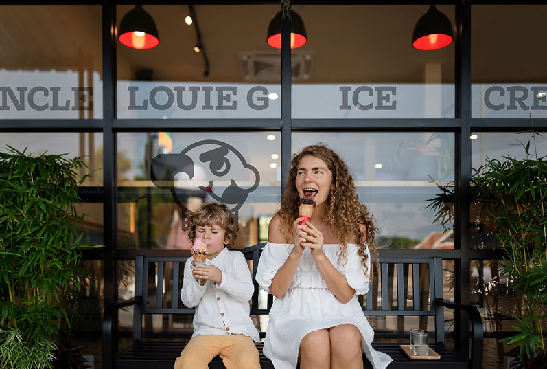
Despite having an endearing brand personality, Uncle Louie G struggles to keep up with other ice cream and Italian ice parlors due to its outdated aesthetic. To help compete with other parlors and break into more markets, Uncle Louie G would need an updated visual style while maintaining brand equity to prevent losing existing customers.
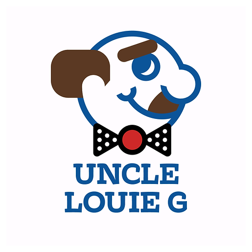
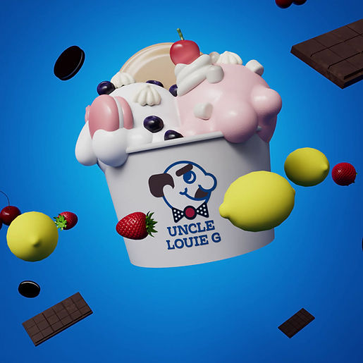
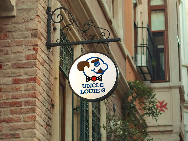
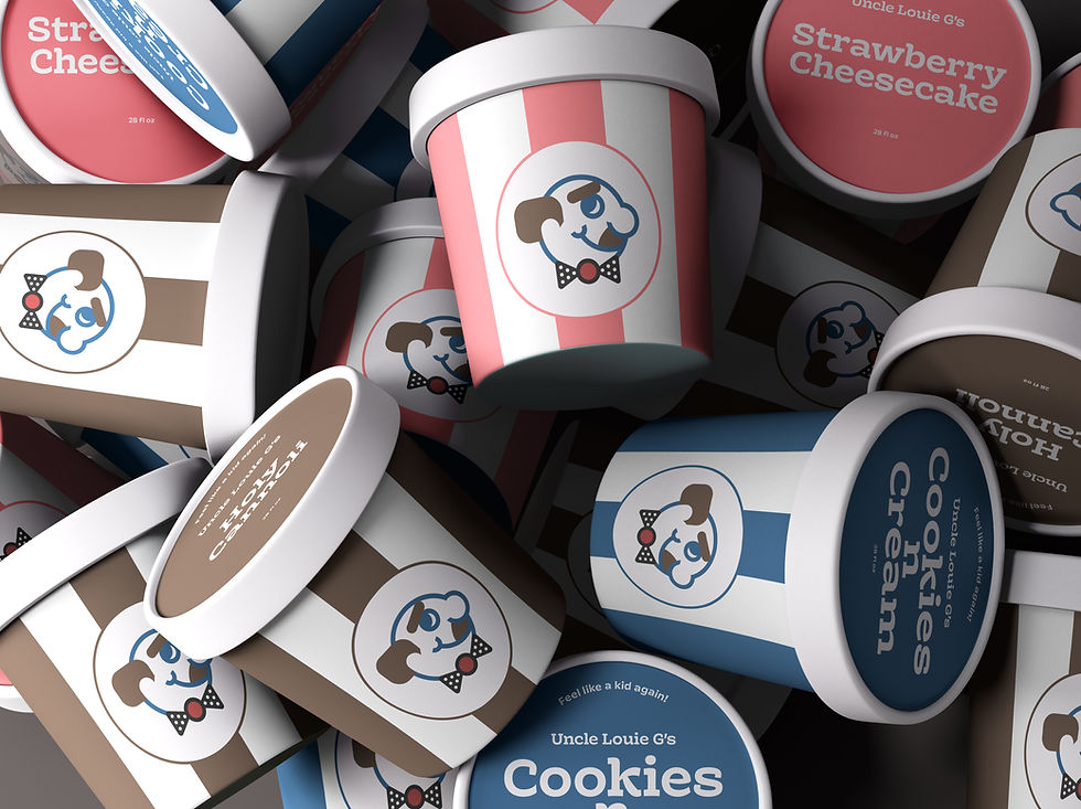
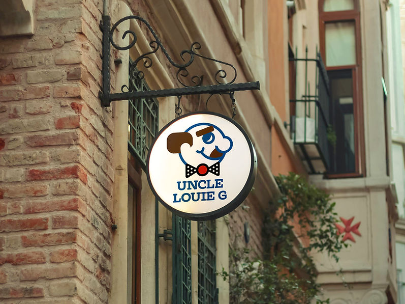
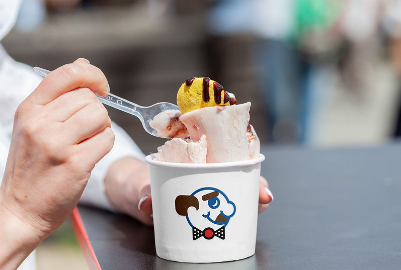
The strategy is to retain the parts that have brand equity — the mascot and color blue — and bring them into a more contemporary style. The logo will be simplified for better readability and the color blue will be complimented with other ice cream appropriate colors. New typefaces will be introduced to match the brands values, and a social media campaign would be created prior to the launch to introduce the rebrand to the public.


bottom of page